- Tinted Paints
- Interior Emulsion Paint
- Interior Trim Paint
- Interior Varnishes & Oils
- Interior Furniture Paint
- Anti Mould Paint
- Anti Damp Treatment
- All Surface Primer
- Special Surface Primer
- Floor Paints & Coatings
- Exterior Paint
- Exterior Masonry Paints
- Exterior Trim Paints
- Exterior Paint Undercoat
- Exterior Oils & Varnishes
- Shed & Fence Paints
Monthly Archives: September 2018
-
September 26, 2018Posted: September 26, 2018Categories: PromotionsRead more
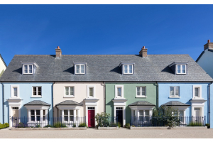
It’s hard to believe that a whole year has passed since the launch of “Heart Wood”, Dulux’s colour of the year for 2018, but it’s true. So instead of dwelling on the past let’s look to the future and take a look at the 2019 Dulux colour of the year “Spiced Honey”.
What Dulux say about it
“Chosen by Dulux colour experts to reflect the new positive mood of the moment. Spiced Honey is a warm amber tone, inspired by the beauty and versatility of honey itself. Spiced Honey can be soothing or calming, cosy or vibrant, depending on the palette you pair it with.”
Colour palettes
As well as the colour itself Dulux have also created a set of themed palettes to accompany the new colour and help customers to blend the colour into their home décor. Whether looking to create a soothing place to think, a calming place to dream, a cosy place to love or a vibrant place to act, the new palettes will
-
September 06, 2018Posted: September 06, 2018Categories: PromotionsRead more
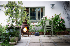
Have you ever wondered how you could improve the décor of your home but struggle to get inspiration? Perhaps you’ve seen things on Pinterest, Houzz or Instagram, but can’t seem to replicate them at home. Not everyone is blessed with a great eye for decorating and design, but this article should help give you some handy hints to help you improve the décor of your home.
Create interest with odd numbers
There’s a reason photographers use something called the rule of thirds and it involves designing with odd numbers to help create harmony and visual interest. The basic concept is that odd numbers help draw more attention and are a lot more appealing than even-numbered object pairings.
To add to this you can group similar objects together, e.g. different heights of candles in different colours to create even more interest and make these more visually attractive. By avoiding even numbered patterns you help to stop things looking too

Recent Posts
April 05, 2024
March 22, 2024